Flexible CSS rule-sets to keep your images within their parent element
Since an image is worth a thousand words, we use images in your webpage to express complex ideas succinctly.
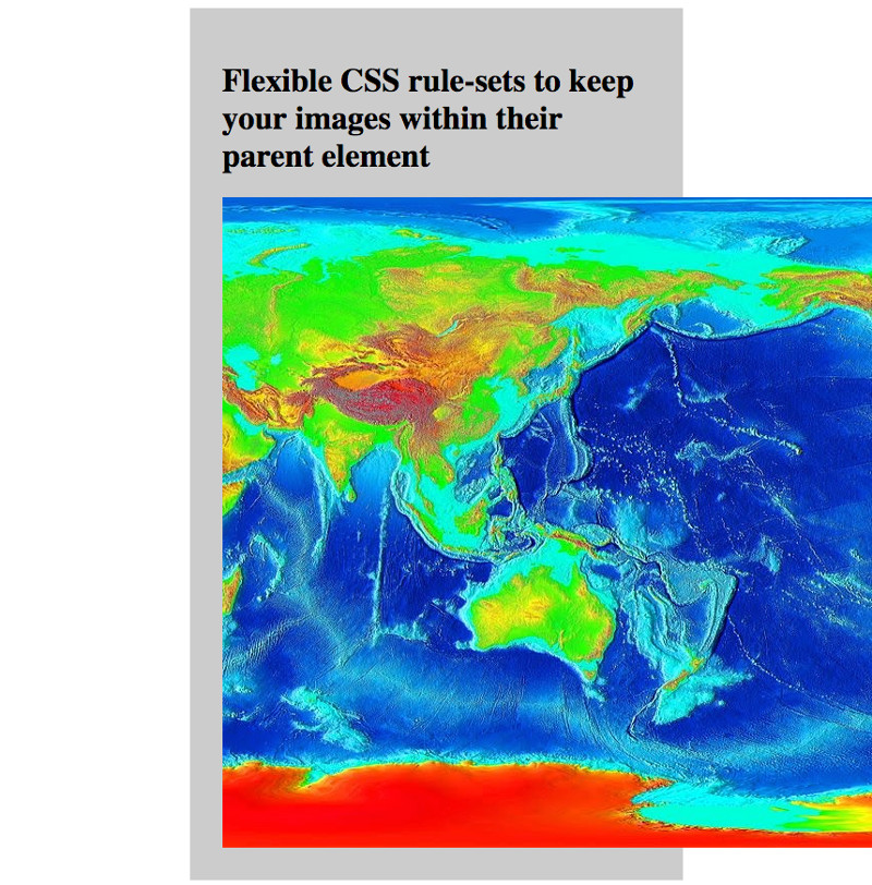
By default, if we do not specify any dimensions for an image, most browsers will show the image according to its actual size. In this situation, an image will appear to spill over the boundaries of its parent element if it is bigger.
For example, the following screenshot shows the image at https://commons.wikimedia.org/wiki/File:LARGE_elevation.jpg spilling over its parent element:

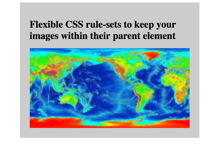
One way to prevent a larger image from going beyond the boundaries of its parent element is to give a standard width to all images. However, if the actual width of an image is smaller than the given width, the image will be stretched:

This post shows the CSS rule-sets that you can use for flexibly keeping images within their parent element.


Follow us