Rendering multiple checkboxes with WTForms and Bootstrap
When you use WTForms and Bootstrap, you can quickly build up the dashboard for your own content management system with Python.
This is because WTForms provide several out-of-the-box implementations for rendering some basic fields that for capturing form data.
However, rendering multiple checkboxes can be open to different UI implementations based on users' preferences. Therefore, different fields and widgets are available in WTForms to cater for different ways of displaying a form input to the user.
Given these points, let's see how we can render multiple checkboxes with WTForms and Bootstrap.
Rendering multiple checkboxes with WTForms only
First, let us look at a sample implementation of rendering a list of checkboxes with WTForms.
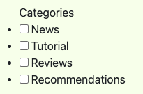
If we render MultiCheckboxField without any CSS styling, we get a dotted list of checkboxes.

Given that, we know that the sample implementation had rendered an unordered list of checkboxes.
Implementing a WTForms field to display a list of checkboxes with Bootstrap's list group component
Since the sample implementation renders our checkboxes as an unordered list of checkboxes, the HTML structure bodes well with Bootstrap's list group component.
Including own CSS classes to the different HTML tags rendered by ListWidget
Once we had decided on the Bootstrap component to use, we can look at how we can insert the relevant Bootstrap classes into our HTML elements.
In order to achieve the list group component styling, we need to render:
- the ul element with list-group class
- the li element with list-group-item class
- the input element for the checkboxes with form-check
First, let's include the CSS classes to the li and input elements first.
from wtforms import SelectMultipleField, widgets
from markupsafe import Markup


class BootstrapListWidget(widgets.ListWidget):

    def __call__(self, field, **kwargs):
        kwargs.setdefault("id", field.id)
        html = [f"<{self.html_tag} {widgets.html_params(**kwargs)}>"]
        for subfield in field:
            if self.prefix_label:
                html.append(f"<li class='list-group-item'>{subfield.label} {subfield(class_='form-check-input ms-1')}</li>")
            else:
                html.append(f"<li class='list-group-item'>{subfield(class_='form-check-input me-1')} {subfield.label}</li>")
        html.append("</%s>" % self.html_tag)
        return Markup("".join(html))


class MultiCheckboxField(SelectMultipleField):
    """
    A multiple-select, except displays a list of checkboxes.

    Iterating the field will produce subfields, allowing custom rendering of
    the enclosed checkbox fields.
    """
    widget = BootstrapListWidget(prefix_label=False)
    option_widget = widgets.CheckboxInput()
If you look into the default rendering logic of ListWidget, you will see that it does not allow a way to include CSS classes to the child elements of the ul element.
Therefore, we first create a subclass of ListWidget and modify the __call__ method to include our own CSS classes into the relevant HTML element.
Once we had done so, we then define MultiCheckboxField to use BootstrapListWidget as the widget.
After we had completed our MultiCheckboxField, we can then include it in our FlaskForm:
from wtforms import TextAreaField

class PageForm(FlaskForm):
    categories = MultiCheckboxField('Categories',
                                    choices=[('news', 'News'),
                                             ('tutorial', 'Tutorial'),
                                             ('reviews', 'Reviews'),
                                             ('recommendations', 'Recommendations')])
    content = TextAreaField('Content')
Rendering our MultiCheckboxField field in Jinja template
Finally, we can render our MultiCheckboxField in our Jinja template.
Given that the form variable is an instance of PageForm, we can do so with the following template code segment:
    {{ form.categories.label(class_="form-label") }}
    {{ form.categories(class_="list-group") }}
As shown above, we had included the list-group CSS class to the ul element at the point when we render the MultiCheckboxField field.
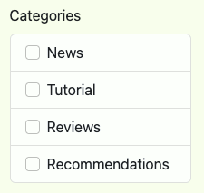
When we browse to the web page rendered by our Jinja template, we can now see that we have a list group of checkboxes.
